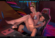
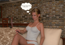
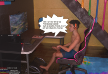
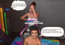
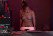
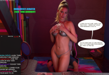
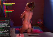
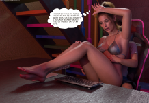
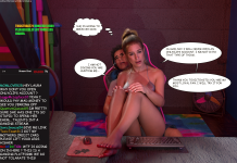
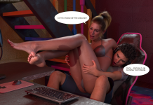
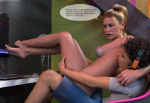
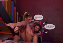
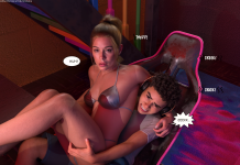
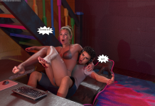
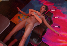
I’ve seen the first issue, and I see some problems with it.
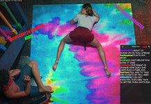
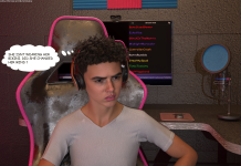
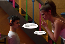
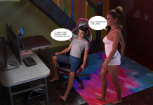
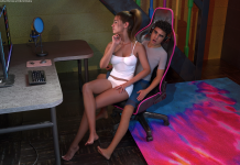
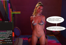
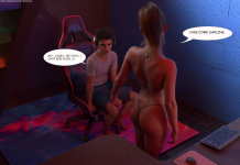
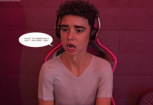
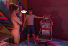
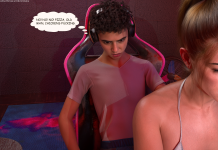
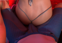
There is too much AI involved in generating the models.
I assume this is why the image sizes are disproportionate.
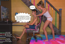
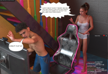
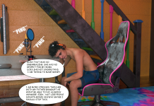
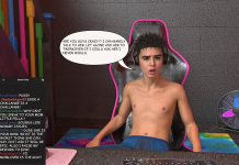
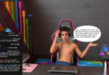
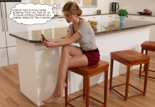
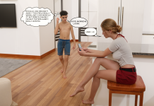
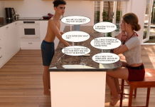
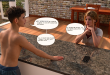
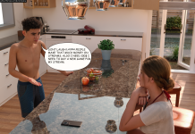
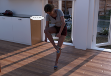
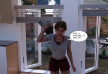
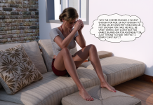
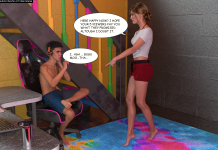
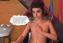
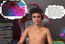
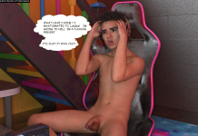
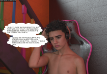
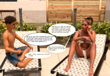
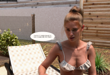
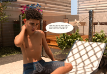
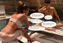
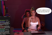
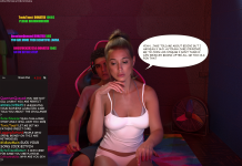
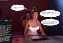
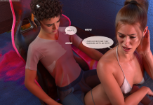
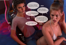
The text leaves a lot to be desired, both in terms of how the lettering looks (not very good) and the spelling errors.
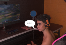
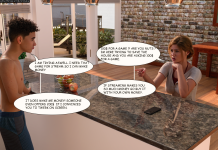
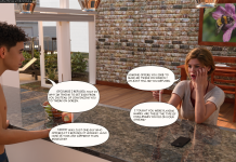
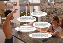
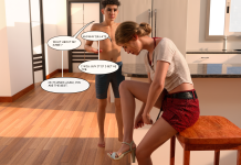
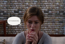
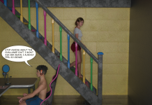
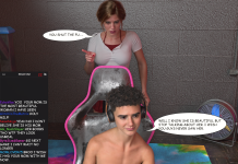
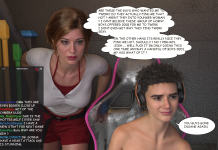
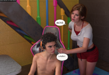
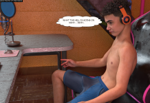
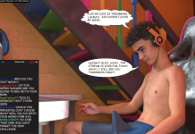
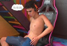
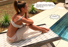
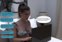
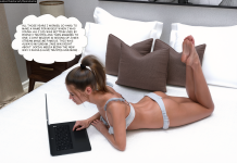
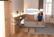
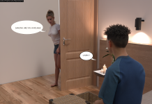
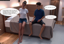
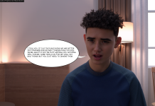
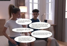
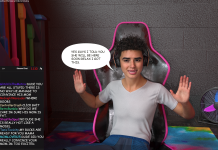
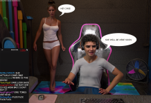
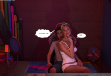
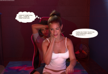
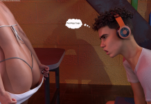
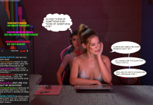
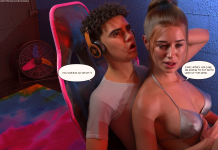
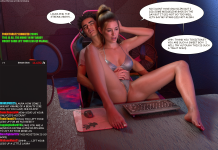
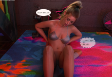
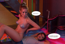
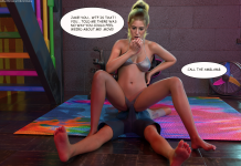
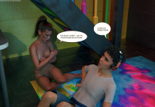
I feel the speech bubbles were added in a rather sloppy way; looking at page 37, it even seems like one bubble was superimposed over another (where it says "Laura!"), which makes me wonder if there’s an alternative version where she has a different kind of relationship with him or calls him by a different name.
I also noticed some recycled pages (29 and 30; 67, 74, and 80; 75 and 78).
And I find it very strange that the last page (101) lacks the usual "To be continued" or "End of episode" notice.
That said, the story itself strikes me as interesting and full of potential.
My advice to the artist: more craftsmanship, less AI. Optimize image sizes and improve the appearance of the speech bubbles.
Edit: I just saw that the artist's Suscribestar account is under review. I wish the guy all the luck in the world and hope they don't shut it down.
There is too much AI involved in generating the models.
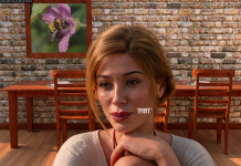
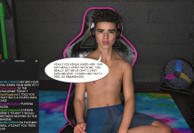
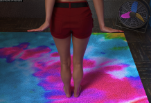
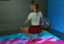
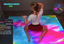
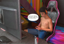
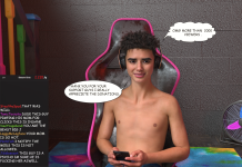
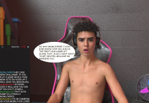
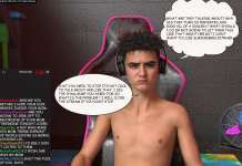
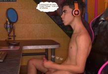
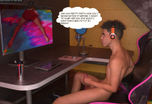
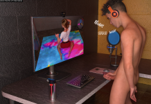
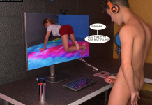
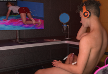
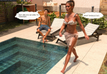
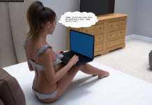
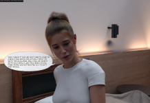
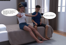
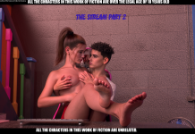
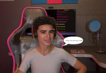
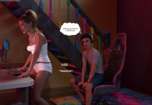
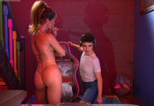
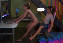
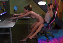
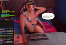
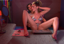
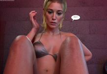
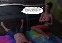
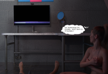
It's glaringly obvious. There's such a stark contrast between the characters' appearance and the set design—which is just awful, with a rough finish and poor visual quality. The textures of the floor, the walls, the son's computer equipment, etc.
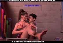
But human models are create from DAZ3D with Genesis 8.0/8.1 models, not from AI.
The text leaves a lot to be desired, both in terms of how the lettering looks (not very good) and the spelling errors.
He received sound advice to correct all of this, for example, via:
https://www.grammarly.com/
Which would certainly be no small help.
And I find it very strange that the last page (101) lacks the usual "To be continued" or "End of episode" notice.
You're right, but he doesn't use the commonly used phrase “To be continued.” That's because he hasn't published the rest yet, but Chapter 2 isn't complete. Half of it is missing.
That said, the story itself strikes me as interesting and full of potential.
I agree with you—that’s its strongest point. But to keep the story going and maintain the reader’s interest, engagement, and appeal, the characters will need to be developed; otherwise, it would be nothing more than a series of sex scenes akin to pornography, where the story—which should serve as the underlying structure—would be invisible.
I just saw that the artist's Suscribestar account is under review. I wish the guy all the luck in the world and hope they don't shut it down.
SS hasn't verified his account because he doesn't have enough followers on social media (that's nonsense—who cares? I never go on those sites anyway, and there's no shortage of REAL dedicated sites).
Yes, he has his work cut out for him; all the settings need to be reworked to achieve a higher aesthetic quality. He needs to do his research. For example, :
Chapter 1 > pages 082 to 101
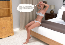
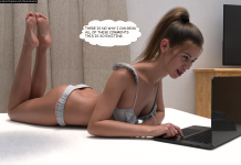
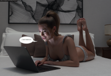
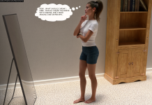
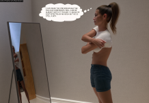
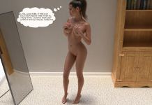
Laura’s bedroom. It’s a guy’s room, not a girl’s—and certainly not a woman’s. There’s no warm, personalized decor—women create their own aesthetic worlds, especially in their bedrooms. There’s usually a vanity table for makeup and other items specific to women. The furniture is made of natural wood, but the mirror is metal and placed on the floor? That’s inconsistent.
Chapter 1 > images 082, 084, 087
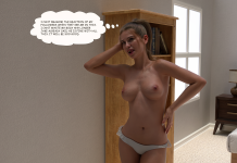
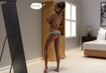
There are curtains at her bedroom window. Images 100 and 101 (Final) > The curtains are gone, and the window frame is as hideous as it is simplistic.
Furthermore, in
Chapter 1 > images 082, 100, and 101 (Final)
The window is to the LEFT of her bed. Whereas in images 083, 084, 085, and 087, the window is now to the RIGHT. Could her room have windows on both sides of the bed, even though it’s so narrow between the two walls/partitions? No way...
But, he deserves credit for choosing body measurements for Laura that aren't the usual unrealistic big breasts (especially in terms of their shape, fit, and nipple placement) and big butts. At least he chose a body that looks like a real woman—the kind we might come across in (real) life. Even though, personally, I prefer any natural woman to any artificial, enhanced beauty—starting with the absence of female body hair, which is, after all, natural. (Software like DAZ3D does a poor job with female body hair, even though it has an extensive library of male body hair—which, in the end, men don’t.)
DesireLama
Also, he deliberately published his first story in this file quality because otherwise he wouldn’t have been able to get his name out there. ((Is this similar to Laura's professional life?...) He comes across as a morally honest, humble person who asks for feedback so he can improve.
I published his series here to encourage him and help him gain recognition. He’s just starting out, but he seems to have a great personality. In contrast, we have the example of Himeros3D, who stands head and shoulders above the rest in terms of quality and skill, but whose personality is completely incompatible with monetizing his talents. Especially since he has a habit of starting stories and then not finishing them and/or developing them further. (“Eternel Summer” and “Dear Diary,” for example)—even though he uses two pseudonyms to publish, he follows the same pattern. And that’s a shame, because he’s far above the run-of-the-mill creators found on every page.
In conclusion,
DesireLama has a lot to learn when it comes to graphic design, aesthetics, lighting, and skin textures (like almost all authors, there’s a lack of textures—or textures that are believable for the character’s age—and this is a major shortcoming).
Regards.


. Lastly ı have a request from you guys, Subscrıbestar does not approve my account because ı lack socıal medıa followıng, ıf you could joın my dıscord ı would be most happy.