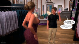
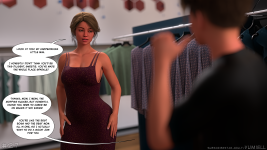
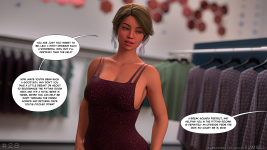
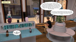
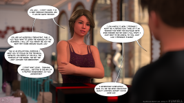
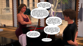
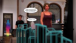
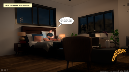
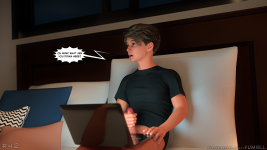
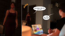
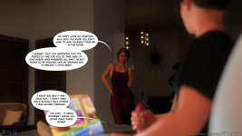
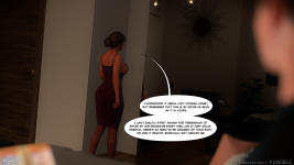
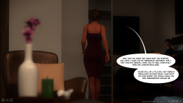
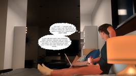
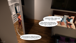
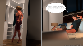
I'm Vumiell, a relatively new adult comic creator around here, and this is my first comic. Your support means a lot to me, if you like my work, please consider subscribing. Best regards!
As a word of advice, to ensure that this story doesn’t end up looking, graphically and from an aesthetic point of view, like every other AC – which usually all tend to look alike in terms of character design – it might be wise to bear a few things in mind:
- If her son is 18 years old, even if she gave birth at 18 or 19, she must be at least 36 or 37. Her skin texture can’t be that of a 20-year-old girl, can it?
- Her breasts, too, can’t be round, perky and with perfectly centred nipples.
These are the same mistakes that creators make time and time again in story after story. Unless they’ve never actually seen a real woman of that age, this is the stuff of science fiction or the author’s fantasies. Not to mention the enormous or disproportionate breasts and the bottoms that go with them.
It’s the same DAZ3D Genesis 9 or 8/8.1 characters that keep cropping up from one creator to the next, who no longer create much in the way of character design, other than the faces they modify.
“Focusing on realistic breasts, back, body proportions, the distribution have to be balanced, and real.”
Otherwise, I’ve noticed that you have a good command of lighting and depth of field, and your scenes are rich in detail.
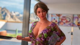
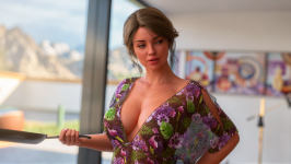
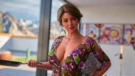
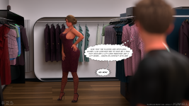
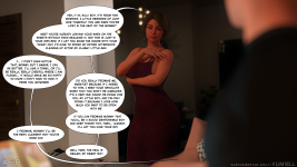
Here are three versions of page 22 featuring skin textures and adjustments to the angle and colour temperature of the light, depending on her age, as if she were:
- 36 years old
- 42 years old
- 57years old
I haven’t altered her bust, even though its shape and position appear, as usual, unrealistic. A woman’s breasts of this size cannot remain at such a height. This is all the more true as she gets older, and especially as she has given birth. Breasts sag to varying degrees and at different rates, depending on a person’s genetic makeup. The same goes for the ‘unreal-sized cock’ trope, where the male character simply has to have a massive cock. It’s so repetitive it’s pointless. Is this a frustration on the part of the creators, who remain convinced that you have to have a massive cock? They might as well just draw horses.
Other positives: You offer your exports in 4K with files of a decent size so that there’s still plenty of detail and light in them. Take page 22, for example, which is 6.1 MB. This is where you stand out from the rest, who generally make do with advertising 4K at 1 MB per file (rubbish), like ‘Mando Logica’, who couldn’t care less about their subscribers. Their page is an absolute shambles, with no organisation whatsoever. You have to go fishing for links, if they’re still active.
I’ve had a look at your page on SubscriberStars: it’s well-organised and tidy; you offer a text-free version and a version with a different camera angle. Well done! I’m looking forward to seeing what comes next to get a feel for how it looks, and if it’s good, I’ll take out a Gold subscription to access your creations and support you.
All that’s missing are files in the PNG format without any compression, rather than that dreadful, image-destroying JPG format. The MP3 of the image… I know that Subscripterstars insists on the JPG format so they can add their "watermarks ‘numbers" during downloads. As they don’t seem capable of doing this with PNG files – because they, too, couldn’t care less about the customer, starting with their non-existent so-called customer service. PNG files naturally take up more space, given their higher quality compared to those rubbish JPG files. Because by adding a watermark, they’re re-compressing a file that’s already been compressed and has degraded content. No doubt about it, SS are very particular about file quality… Rubbish.
However, you can sort this out yourself: when you’re ready to publish a watermark-free version, use a file-hosting service – such as MEGA, for example – though 1fichier is much better quality > create a ZIP file of the relevant chapter’s content > upload it > and there you go, the PNG is also accessible to your subscribers at the tier of your choice (Gold, perhaps).
Keep going, don’t give up – you’ve got talent. Just make sure you stand out from the crowd of creators who are far too repetitive, endowing their characters with the same traits.
SOME MORE TIPS
I’d like to add to my previous message: if this could be of use to you in your creations, I think they would be much more appreciated, especially given the repetitive patterns that the vast majority of authors keep using.
Another key point for a story intended to span several chapters is the need to strike a balance between the characters’ thoughts, words, sexual behaviour and personalities. Without well-developed characters, the story cannot hold the reader’s interest in the long term; at best, it will merely arouse a sudden physical, sexual appetite that is quickly extinguished.
Building desire is essential to the narrative; without it, the story is nothing more than vulgar, run-of-the-mill pornography, akin to consuming fast food, offering the reader no real reward.
Peagus Smith, with "Au Naturel", had come up with a good story, but these characters have identical or very similar physical forms; there is no variety. Just like women’s breasts, which all have the same curve—only the size varies—but with these mammary protuberances that go beyond common sense and good taste. And personality can only emerge through the plot; on this point, Peagus Smith, by chapter 30, is repeating himself in the narrative, with plot developments that are all too predictable and obvious. This is, in fact, what members are writing on the dedicated thread for this series, “Au Naturel”:
I agree about Pete getting his desire granted and saving Darnell can be the perfect reason for it but chapter 30 being worse than forced out of nowhere chapter fucking 10 the one that ruined Rory involvement in the story and Brandi motivations for 19 chapters? I would believe it until I see it, if PS makes Victoria a nympho by allowing Carl to join the fun again and also Martin this scenario would be worth it.
IKEA man.. please move all comics to the fun part.. no so boring.. and these days you are got some points from .ai tool, regarding some videos..Pegasus.. focus and make the comics better no so sht.. like this...now you look like our friend AD ...and kill the black guy..Pegasus..please ficus and dont make also Timmi boring... some people give you money for your shtS..pleasebmake one good Volvo
Whilst the storyline is fizzling out with "Au Naturel", the artwork isn’t spared either. The post-production, which has been slapdash for the last few chapters, shows visible artefacts; the software used for the speech bubbles causes graphical errors during final compression (and it really is compressed); the clothes lack textures and look like nothing more than plastic or rubber bags.
One other author, Santo Fabbro, with "Unconditional Love" or "Heartbreak Remedy", has fully grasped the importance of developing and bringing out the characters’ personalities. He is also the only one, alongside Himeros3D ("Dear Diary"), to take into account the weight of the breasts depending on their size and position. In this respect, Santo Fabbro is by far the only one and stands head and shoulders above all the others. When it comes to the quality of female bodies with a realistic, believable physique, Himeros3D is the undisputed leader, far ahead of all the others.
The mistake with this sort of story is labelling it an "Adult Comic", which leads the creators to resort to the same unrealistic tropes found in comics: gigantic breasts (unless you’re into cow’s udders or fake breasts?) and bums of the same size.
As for porn, I reckon there’s no shortage of it online, so you need to stand out from the repetitive crowd. Don’t try to copy the same bodies/breasts/pussies graphics as everyone else, with the same physical attributes. Otherwise, why would subscribers support you?
And if I were to mention the worst detail of all: the lack of hair – pubic hair – on the characters. Inevitably, DAZ3D and Blender are rubbish at rendering arms hair, pubic hari. At best, it looks like a scouring brush, but not like pubic hair. They call a square or rectangular patch of hair a "bush". I fear that these authors have never had any experience other than porn and mentally fragile, or even immature, women to copy such a lack of human body hair. This results in smooth, streamlined beings, stripped of their human appeal. Or even a penchant for paedophilia on women bodies?
The commercial model of publishing 10 pages a week is quite clear in its rationale: to get subscribers to pay month after month. However, the cost of a single chapter, or even a series, is exorbitant. Therefore, in my humble opinion, this is not the right model for retaining subscribers in the long term.
If these articles can help you improve and avoid producing the same kind of work as the majority of others, you’ll have saved yourself a few years of following the crowd.
SOME MORE TIPS
I’d like to add to my previous message: if this could be of use to you in your creations, I think they would be much more appreciated, especially given the repetitive patterns that the vast majority of authors keep using.
Another key point for a story intended to span several chapters is the need to strike a balance between the characters’ thoughts, words, sexual behaviour and personalities. Without well-developed characters, the story cannot hold the reader’s interest in the long term; at best, it will merely arouse a sudden physical, sexual appetite that is quickly extinguished.
Building desire is essential to the narrative; without it, the story is nothing more than vulgar, run-of-the-mill pornography, akin to consuming fast food, offering the reader no real reward.
Peagus Smith, with "Au Naturel", had come up with a good story, but these characters have identical or very similar physical forms; there is no variety. Just like women’s breasts, which all have the same curve—only the size varies—but with these mammary protuberances that go beyond common sense and good taste. And personality can only emerge through the plot; on this point, Peagus Smith, by chapter 30, is repeating himself in the narrative, with plot developments that are all too predictable and obvious. This is, in fact, what members are writing on the dedicated thread for this series, “Au Naturel”:
Whilst the storyline is fizzling out with "Au Naturel", the artwork isn’t spared either. The post-production, which has been slapdash for the last few chapters, shows visible artefacts; the software used for the speech bubbles causes graphical errors during final compression (and it really is compressed); the clothes lack textures and look like nothing more than plastic or rubber bags.
One other author, Santo Fabbro, with "Unconditional Love" or "Heartbreak Remedy", has fully grasped the importance of developing and bringing out the characters’ personalities. He is also the only one, alongside Himeros3D ("Dear Diary"), to take into account the weight of the breasts depending on their size and position. In this respect, Santo Fabbro is by far the only one and stands head and shoulders above all the others. When it comes to the quality of female bodies with a realistic, believable physique, Himeros3D is the undisputed leader, far ahead of all the others.
The mistake with this sort of story is labelling it an "Adult Comic", which leads the creators to resort to the same unrealistic tropes found in comics: gigantic breasts (unless you’re into cow’s udders or fake breasts?) and bums of the same size.
As for porn, I reckon there’s no shortage of it online, so you need to stand out from the repetitive crowd. Don’t try to copy the same bodies/breasts/pussies graphics as everyone else, with the same physical attributes. Otherwise, why would subscribers support you?
And if I were to mention the worst detail of all: the lack of hair – pubic hair – on the characters. Inevitably, DAZ3D and Blender are rubbish at rendering arms hair, pubic hari. At best, it looks like a scouring brush, but not like pubic hair. They call a square or rectangular patch of hair a "bush". I fear that these authors have never had any experience other than porn and mentally fragile, or even immature, women to copy such a lack of human body hair. This results in smooth, streamlined beings, stripped of their human appeal. Or even a penchant for paedophilia on women bodies?
The commercial model of publishing 10 pages a week is quite clear in its rationale: to get subscribers to pay month after month. However, the cost of a single chapter, or even a series, is exorbitant. Therefore, in my humble opinion, this is not the right model for retaining subscribers in the long term.
If these articles can help you improve and avoid producing the same kind of work as the majority of others, you’ll have saved yourself a few years of following the crowd.
Hello, thank you so much for your comments, feedback, and support!
I can't really comment on matters regarding other comic creators; everyone has their own preferences and opinions. I am still very new to this field and am trying to improve myself.
Rest assured that I read and take note of all the comments and criticisms posted here, but I generally prefer not to get into debates on forums, which is why I don't reply to comments very often.
I'm Vumiell, a relatively new adult comic creator around here, and this is my first comic. Your support means a lot to me, if you like my work, please consider subscribing. Best regards!
I'm Vumiell, a relatively new adult comic creator around here, and this is my first comic. Your support means a lot to me, if you like my work, please consider subscribing. Best regards!
Don't be silly! No, it's innocent way to share son love to his mom. Business as usual, nothing to be ashame, come on, you can see that every single day on... AC only.
Yes sir, grab points to get rank update. How? Answer few messages on existant threads and you will get it. It's a matter of rank, whatever the way to reach it. And you could create new thread.
I just read the new pages (23–60). Thank you for these.
1 - THE SPIRIT OF HISTORY
The way the relationship between the mother and her son develops is unexpected. I gather that the mother’s stance differs from the usual plotlines: the son is turned on by his mother’s appearance (nothing new there), but instead of being horrified by the sight of her son masturbating in their bedroom (since they share it, as I understand it). If you’re going to cross the line, you might as well do it comfortably, right? But the mother’s “open-mindedness” is more than just an invitation for the son to continue taking certain… sexual liberties.
2 - DIALOGUE BALLOONS
The font you're using is great—clear and easy to read. What is it?
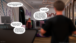
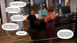
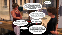
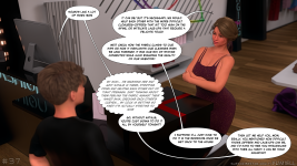
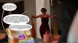
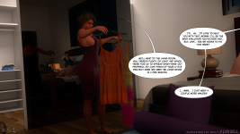
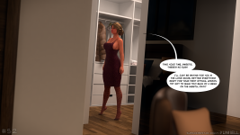
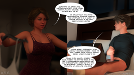
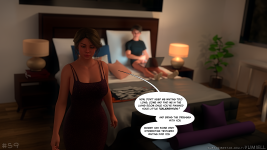
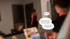
There’s too much dialogue within a single panel, and the software you’re using takes countless detours for the same line of dialogue. (Panels 35, 36, and 37, for example).
Wouldn’t it be better to split the lines of dialogue in a single panel into two or three separate panels, even if that means changing the angle or zoom level?
Because it’s too cluttered, and it’s hard to tell who’s speaking first, etc. That’s why I’m numbering the dialogue in order of speaking.
Not only is this uncomfortable to read—which makes readers want to skip the dialogue without reading it—but it also detracts from the aesthetics of the panel, as the text obscures too many of the elements that make up the panel.
I'm not saying it's the best, but it's the one that meets my criteria:
Numbering on the speech bubbles to immediately identify the reading order of the text.
A different background color for each speech bubble to identify the character.
A font that makes for crisp, clear, and comfortable reading.
Although in the image I used for my example, the speech bubbles aren't wide and each line of text is short, which isn't the most comfortable layout. But I don't like long, wide speech bubbles because they obscure the image's content—except in clearly defined cases.
Example 1/2 with a colored bubbles background
Example 2/2 with a white bubble background
(From Dear Diary, by Himeros3D, custom version)
3 - WOMEN'S BODIES
Not many of the AC creators seem to know and to have read Freud, Nietzsche, and Lacan.
I can see it coming a mile away: the mother is going to have the same breasts as in the other ADs—well (too?) shapely, high-set, with perfectly centered, well-defined, and pronounced areolas and nipples. This isn’t natural, and it doesn’t create any erotic appeal. Unless your sexual fantasy is rooted in ’90s porn culture, from the 2000s to today: fake, fake at every level—silicone breasts, lips injected into a “toilet duck” shape, plump lips (ready to suck)—and, in the best-case scenario, three pubic hairs dueling in the shape of a line or rectangle, or even better, a line on the pubis and nothing on her labia. It’s not even like the depictions of female bodies by Sandro Botticelli (Italian Renaissance painter, 1445–1510). In short, the opposite of a woman, of feminine expression. Too common—we’ve seen it all before. Nature creates diversity through variation. No two breasts are identical; a woman never has two perfectly symmetrical breasts that are identical in every way. Her left breast is generally smaller than her right: the heart is on the left and absent on the right.
What bothers me? The skin textures. There aren’t any—she has the skin of a little girl, not that of a woman in her forties. I’ve already mentioned this to you. And in this regard, it’s the usual portrayal of female bodies in adult games, which are just as unrepresentative of a woman as an ambassador of feminine charms.
4 - THE SON'S BODY
It's no different from the other ACs either; his penis is more like a horse's than a human's.
He, too, no longer has a single pubic hair. Humanity is moving in the opposite direction of its fundamentals, of its natural needs, and is embracing the useless, the mutilation of mind and body: Aequilibrium essentiale inter corpus et animum (Which in Latin means: An essential balance between body and mind).
This need to give them limbs that are supposed to drive the so-called women in these stories wild. You only need to have talked to women to know that those of average build have absolutely no desire to have an abnormally large penis inside their vagina—and for good reason: when you understand a woman’s anatomy, you realize it’s not designed for that. Unless you enjoy pain, but that’s a whole other realm of BDSM.
As for the rest of his body, it is harmonious, well-proportioned, and well-built.
5 - SET DESIGN AND LIGHTING
When it comes to lighting, you have a perfect grasp of the subject, including color temperatures.
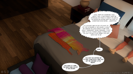
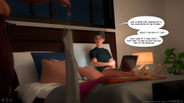
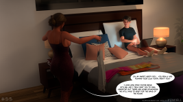
There’s a lack of texture, shading, and folds in the fabrics. For example, in images 01-41, 42, 54, 55, and 56, on the bed, the son is leaning against the wall-mounted headboard, with a large pillow between his back and the headboard. There isn’t a single fold or even a shadow of a fold; it looks more like a wooden plank than a piece of fabric.
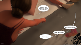
The throw blanket on the bed (onto which he ejaculated in image 01-57), which serves no purpose other than aesthetic, isn’t supposed to remain on the bed when it’s in use, and the lack of texture leads me to believe it’s made of plastic. Furthermore, such blankets are more commonly found in hotels than in private bedrooms.
The field of interior design is guided by the triad of color, material, and light.
Even if the lighting is warm or sets the mood you were going for, the room lacks a sense of warmth; it feels cold and impersonal. Here, too, it looks more like a hotel room than a woman’s bedroom. There are no curtains on the windows. Try sleeping when the sun comes up. And speaking of windows, in Feng Shui, windows above the bed aren’t really ideal. I can definitely see a plant or a side table under a window (made of metal: cold, art
From what I can see, the walls are bare—no paintings, framed pictures, or other decorations.
When we talk about warm or cold materials, we rely on our senses—particularly the sense of touch—more than on sight. Walking barefoot on tile doesn’t feel the same as walking on a rug. So we associate these sensations with the temperature of a surface: tile is cold, a rug is warm. Where it gets interesting is when our sense of touch sends information to our eyes. In other words, you no longer need to walk barefoot on tile to know that your feet will get cold if you do. That’s why using so-called “warm” materials gives you the impression of a cozy, inviting atmosphere. Conversely, in a rather cold interior, the decor will feel more elegant but less conducive to relaxation.
You’ve struck a good balance between warm (Dionysos) and cool (Apolinaire) elements, but the decor lacks a sense of human warmth. While this approach works well for a store—creating a clean, balanced space open to the public—a bedroom, especially a woman’s, is meant to reflect the person’s spirit and inner balance. As open-minded as the mother seems, her bedroom feels impersonal, as if it were meant to be used by a multitude of people, like a hotel room.
6 - CONCLUSIONS
You should do whatever you want—it’s YOUR story, YOUR creation. There’s no doubt you have potential and experience in 3D creation. You’re capable of producing images that don’t look like those of a beginner who hasn’t mastered the basics.
But that’s precisely why you should set yourself apart from other creators who just keep copying and pasting the same characters from DAZ3D’s Genesis libraries—settings that are skillfully constructed and rich, but lack human warmth.
What I’ve described is exactly what’s missing in the world of adult content. In a business plan, you need to study a specific niche and identify what’s repetitive and what’s missing. Filling that gap creates a new market and attracts a clientele that, due to a lack of choice, would otherwise settle for the run-of-the-mill. There will always be the basic, clueless guys who don’t care—as long as you throw in some ass, some tits, a big dick, and she sucks it, fucks, and says it’s the best sex of her life, they’ll be happy; the rest, they don’t give a damn about.
I took a look at your SS page (which has now been approved).
Your introduction is welcoming, warm, humble, and inviting.
You allow FREE access, which at least lets people contact you—if necessary or desired—before subscribing. Thank you for that consideration! Generally, authors don’t care about this; they don’t even think about it and no way to send a message before to sign any author subscription.
Unless I misread it, I didn’t see a publication schedule (or one broken down by subscription type). Not that I wanted to know WHEN the next installment will be available. The mother seems so open-minded that her son isn’t going to sit still. But I think he’s going to run into a maternal wall... (What’s too obvious is often misleading and masks the opposite of what it suggests.)